


The following topics are discussed:
This section describes the following:
Each RAD design can have several layouts. However, to maintain peak performance, you should limit the number of layouts you use in a single project. If your project includes more than 30 layouts, you should consider other ways to organize those layouts. Many of the suggestions in "Strategy for Creating Complex Projects" on page 94 apply when creating multiple layouts for a single RAD project.
If you want to add a new layout to an open project in the IDE, choose New from the File menu. In the New window, click the Object tab to display a list of object wizards, as shown in Figure 13.1.
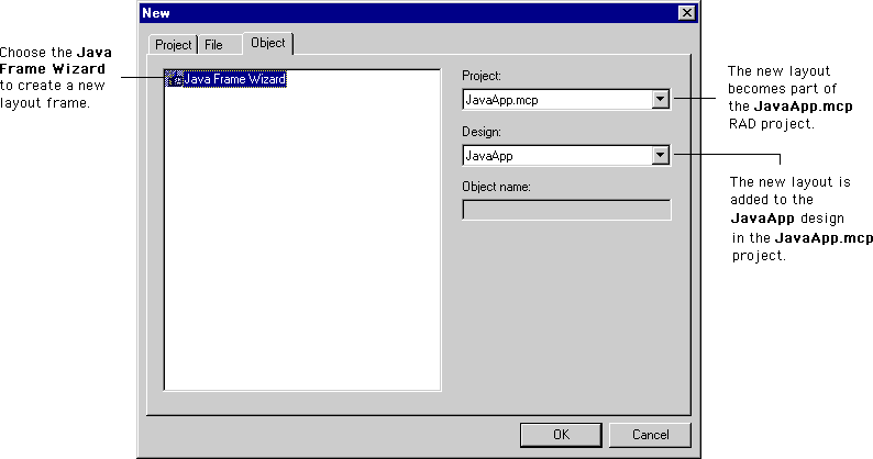
Choose a wizard that corresponds to the layout you wish to create:
When you click OK, the wizard guides you through the layout-creation process. After you configure the new layout's settings in the wizard, click Finish to add the layout to the project and open a new layout window. For detailed information about the available layout wizards, see "Layout Wizards" on page 526.
A layout is modified in the following ways:
For more information about the Component Palette, see "Component Palette" on page 528. To learn more about the Component Catalog window, see "Component Catalog window" on page 532.
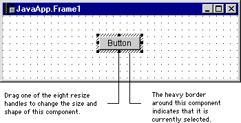
To move an object in a layout, select it in the layout window. A selected object is shown in Figure 13.2. The heavy border around the object indicates that it is currently selected. Drag selected objects to move them to a new positions in the layout window. Alternatively, use the arrow keys on your keyboard to move the selected objects. To resize or reshape an object, drag one of its resize handles in the desired direction. A heavy outline is displayed as you drag the resize handle. This outline represents the final shape of the object when you release the resize handle.
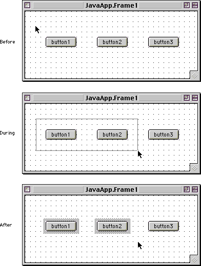
You can select multiple objects in two different ways:
 TIP
TIP
After you place objects in the layout, you can edit the various properties that characterize each object, as well as the events handled by that object. The Object Inspector displays the available properties and events for a selected object. For more information, see "Object Inspector" on page 543.
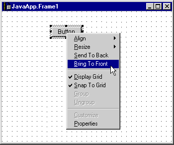
The Layout editor features a contextual menu that conveniently duplicates the commands in the Layout menu. The available commands in the contextual menu depend on the selected item. A sample contextual menu is shown in Figure 13.4.
To display the Layout editor contextual menu:
The following list describes some common graphical editing commands in the contextual menu:
Align-displays a submenu from which you can choose different ways to position selected objects.
Resize-displays a submenu from which you can choose different ways to change the size of selected objects.
Send To Back-moves the selected objects so that they are displayed behind all other objects.
Bring To Front-moves the selected objects so that they are displayed in front of all other objects.
Display Grid-when checked, displays the graphical grid in the layout window.
Snap To Grid-when checked, the Layout Editor automatically aligns objects with the graphical grid.
Group-combines selected objects so that they move together as a group.
Ungroup-separates a selected group so you can move each object independently.
When you create a new layout for your RAD project, as described in "Creating a Layout" on page 519, you select a layout wizard. The wizard helps you complete the layout-creation process. This section describes the following layout wizards:
For beginners Each wizard assumes you have a basic understanding of the associated programming language. For example, if you use the Java Frame wizard, you should understand the difference between an Abstract Window Toolkit (AWT) frame and a Swing frame. If the items displayed in the wizard are unfamiliar, you should consult additional programming language references for more information.The layout wizards include the following navigation buttons:
The Java Frame wizard consists of one step:
1. Describe the frame class for the Java frame.
This section of the wizard, shown in Figure 13.5, lets you specify the class name, package name, and location for the new frame. Other options are available to further describe the frame.
This section includes the following parts:
Enter a name for the frame's class in this field. An example name is provided.
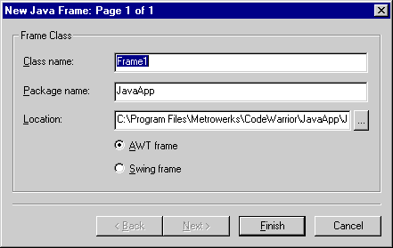
Click this radio button to designate the new frame as a Swing frame.
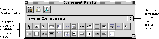
The Component Palette displays graphical tools that represent the components from the current catalog. These tools help you to conveniently build the application's user interface. Choose Component Palette from the Window menu to display the Component Palette, shown in Figure 13.6 (Windows) and Figure 13.7 (Mac OS).
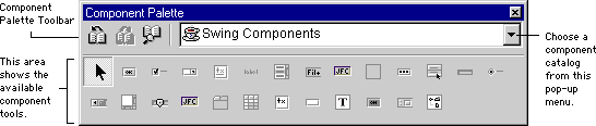
The Component Palette has three main parts:
The Component Palette toolbar provides convenient access to the components detailed in the Component Catalog window. Table 13.1 describes each button in the Component Palette toolbar.
The Component Palette displays component tools from a particular catalog. To use component tools from another catalog, choose the catalog's name from the Catalog pop-up menu, shown in Figure 13.6 (Windows) and Figure 13.7 (Mac OS).
|
Button
|
Name
|
Description
|
|---|---|---|

| ||

| ||

|
The bottom of the Component Palette displays tools from the current catalog. You click a particular tool and then "draw" an object in the layout window. When you finish drawing the object, the Layout editor updates the layout window display. The process is illustrated in Figure 13.8.
To use the Component Palette, do the following:
1. Click the tool representing the component you want to place in the layout window.
2. Drag the cursor while inside the layout window.
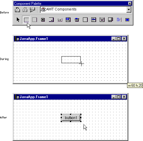
The component is placed in the layout window. You can modify the component's properties and events using the Object Inspector.
For more information about the various component tools in the Component Palette, refer to "RAD Components" on page 549.
TIP
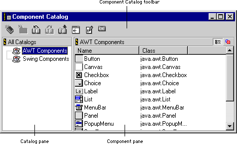
The Component Catalog window lets you drag and drop components from the current catalog onto the layout window. You can also view existing catalogs, import additional catalogs, and create new catalogs. Choose Component Catalog from the Window menu to display the Component Catalog window, shown in Figure 13.9.
This section describes the following:
The Component Catalog toolbar lets you view and manipulate catalogs and their contents. Table 13.2 describes the buttons in the toolbar.
|
Button
|
Name
|
Description
|
|---|---|---|

| ||

| ||

| ||

| ||

| ||

| ||

| ||

|
The Catalog pane, shown in Figure 13.9 on page 532, displays information about available catalogs, including the customized catalogs you create or import. Click the hierarchical control next to a catalog to expand it and view its contents. Click the control again to collapse the view. Alternatively, double-click an item to expand or collapse its view in the Catalog pane.
You can create customized catalogs to store the components you use most frequently. These customized catalogs make it easier for you to build your application's layouts. To learn how to create your own catalogs, see "Creating Component Catalogs" on page 539.
TIP
The Component pane, shown in Figure 13.9 on page 532, displays various information about the items in each catalog. The name of the catalog is displayed in the upper-left corner of the pane. You drag components directly from the Component pane into a layout window to create user interface objects.
The Component pane is discussed in the following topics:
The Content View buttons toggle the display of the components in the current catalog:
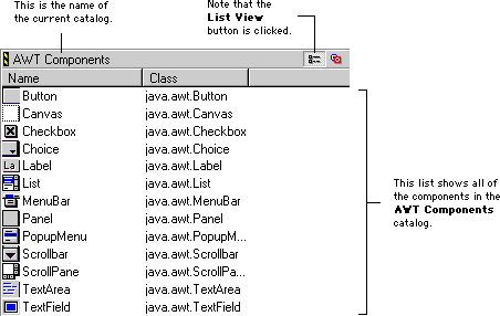
 Click the List View button to display the contents of the Component pane as a list. The List view, shown in Figure 13.10, displays all the components in the current catalog.
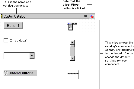
 Click the Live View button to display the contents of the Component pane as live objects. The Live view, shown in Figure 13.11, is only available for component catalogs that you create. Refer to "Creating Component Catalogs" on page 539 for more information.
 NOTE
NOTE
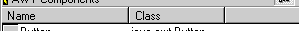
The List view of the Component pane includes a Component Information Bar, shown in Figure 13.12. This information bar helps you organize the components in the current catalog.
You can sort the component list according to the columns in the Component Information Bar. You can also resize each column in the list. For more information, see "Sorting and resizing component lists" on page 538.
Table 13.3 details the columns displayed in the Component Information Bar for various catalog types.
|
Catalog Type
|
Column
|
Description
|
|---|---|---|

| ||
The component list, shown in Figure 13.10 on page 535, displays all components in the current catalog and their associated Component Palette button icons. To place a particular component in your layout, drag it from the component list in the Component Catalog window and drop it into the layout window. As you drag the component inside the layout window, a heavy outline indicates the final position of the component. After you release the outline, the component is placed in the layout window.
For more information about removing objects from your layouts, see "Removing objects" on page 523. Refer to "Layout editor contextual menu" on page 525 for more information about contextual menu commands. To learn about the components in the component list, see "RAD Components" on page 549.
You can sort the components in the List view according to the columns in the Component Information Bar, shown in Figure 13.12 on page 536.
The Component Catalog window features a contextual menu that gives you convenient access to several menu commands. The commands displayed in this menu depend on the item you select. A sample contextual menu is shown in Figure 13.13.
To display the Component Catalog contextual menu:
Control-click an item, or click and hold on an item.
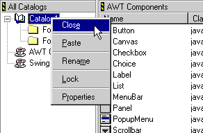
The following list describes the most common commands in this contextual menu:
Close-removes the item from the Catalog pane.
View-changes the current view in the Component pane. You can choose List view or Live view.
New Folder-creates a new folder in the current catalog.
Rename-changes the name of the selected item. After you select this command, type a new name for the item and press Enter/Return.
Lock-locks the selected item. When an item is locked, you cannot change any of its properites (except its "locked" status). However, you can add sub-items to a locked container (such as a folder or catalog), remove sub-items from a locked container, and modify sub-items of a locked container (assuming the items to be modified are not locked). A small lock icon indicates that an item is currently locked.
Unlock-unlocks the selected item.
Properties-displays the properties for the selected item in the Object Inspector.
To create a catalog, click the New Catalog button in the toolbar of the Component Catalog window. Alternatively, choose New from the File menu, click the File tab at the top of the New window, and then select Component Catalog File in the File view. You see the window shown in Figure 13.14.
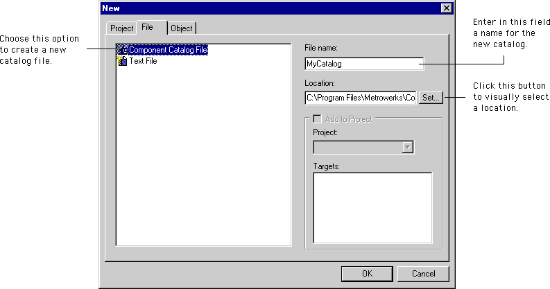
Type a name for your new catalog file in the File name field.
TIP
.ctlg file name extension, like this: MyCatalog.ctlg. This naming convention helps you quickly identify the catalog file on your hard disk. In addition, the Windows-hosted version of the CodeWarrior IDE uses this extension to identify the catalog file.
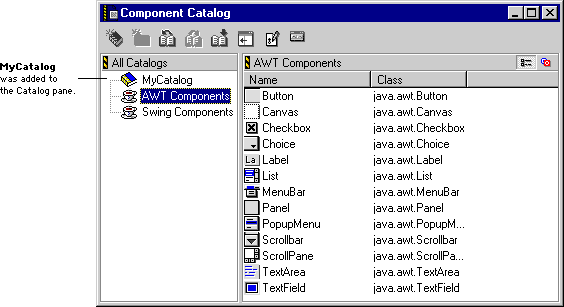
When you finish typing a name for the catalog and choosing a location in which to save that catalog, click OK in the New window. The IDE displays the Component Catalog window and adds the new catalog to the Catalog Pane, as shown in Figure 13.15.
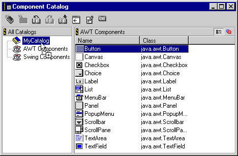
To add a component to your new catalog, follow these steps:
1. Select an existing catalog with the component you wish to add.
2. Select the component you wish to add from the Component pane.
In the example, you would select the Button component.
3. Drag and release the selected component onto your catalog.
In the example, you would drag the Button component onto MyCatalog in the Catalog pane, as shown in Figure 13.16. After you release the Button component, it is added to MyCatalog.
 TIP
TIP
You can also add components to your catalog using the Cut, Copy, and Paste commands in the Edit menu and the Layout editor contextual menu. To use these commands, perform the following steps:
1. Select an existing catalog with the component you wish to add.
2. Select the component you wish to add from the Component pane.
3. Choose the Cut or Copy command.
4. Select the catalog to which you want to add the component.
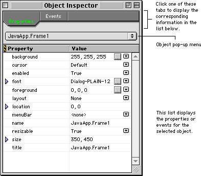
The Object Inspector displays the properties and events for a selected object. You can edit each object characteristic by using pop-up menus, dialog boxes, or by directly typing a new value. Choose Object Inspector from the Window menu to display the Object Inspector, shown in Figure 13.17 (Windows) and (Mac OS, Solaris, and Linux).
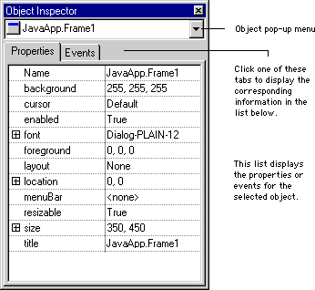
This section describes the following Object Inspector parts:
 TIP
TIP
TIP
TIP
After you make changes, press Enter/Return to let the RAD tools automatically generate source code. An editor window opens, displays the generated code, and highlights the name you chose for the event. Listing 13.1 shows the generated code for a componentResized event in a Java AWT checkbox component.
public
void checkbox1componentResized(java.awt.event.ComponentEvent e)
{
}
You must supply the code that specifies the component's behavior. For example, the generated code in Listing 13.1 does not include any code inside the braces. You must create the code within these braces in order to control the component's behavior in your application. Choose Save from the File menu or press Ctrl/Command-S to immediately save your changes.
The Object Inspector contextual menu provides several convenient commands for manipulating objects. The available commands in this menu depend on the object you select. A sample Object Inspector contextual menu is shown in Figure 13.19.
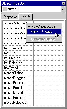
To display the Object Inspector contextual menu:
The following list describes some of the commands in the Object Inspector contextual menu:
Select All-selects the contents of the current text field.
Delete-removes the contents of the current text field.
Customize Object-lets you change object characteristics.
View Alphabetical-changes the Events view so that all object events are listed in alphabetical order, regardless of the groups to which those events belong.
View In Groups-changes the Events view so that object events are displayed in group hierarchies.
 If you decide against using the tool you selected, click the Unselect tool. After you click this tool, you can click a different component tool to use in the layout window.
 To resize the columns in the Component Information Bar, position the cursor between two column titles. The cursor's icon changes to the icon shown at left. Drag and release this cursor to resize the columns.
 Click this button to display a pop-up menu. Choose pre-defined options from the pop-up menu to change the current property value.
 Click this button to display a dialog box. Configure the property value using the options in the dialog box. The current RAD plug-in determines the contents of the dialog box.